Labs from my Geography class called Geography 206, Intro to GIS. All my lab assignments will be posted here!
Monday, November 14, 2011
Tuesday, November 8, 2011
Monday, October 31, 2011
Monday, October 17, 2011
Monday, October 3, 2011
Thursday, September 22, 2011
Lab 4; No more steps!
1) Well the three datasets that I used were in form of Shapefile vector data. There were a lot of other items in there that were raster data but the three that i used were shapefile data.
2)Shapefiles
3) Caves.dbf, Caves.prj, Caves.sbn, Caves.shp, Caves.shx. Lab4_Marble.dbf, Lab4_Marble.prj, Lab4_Marble.sbn, Lab4_Marble.shp, Lab4_Marble.shx. Streams.dbf, Streams.prj, Streams.sbn, Streams.shp, Streams.shx
4) The information given when I opened the prj file was that it gave me the type of data it was and the size of how much data was stored under that file name.
5) .shp: it's a shapefile that describes geometries that are points, polylines, and polygons. The feature geometry itself. Shape format.
.shx: It's a shade index format allowing seeking forwards and backwards of information quickly
.sbn: It's a spatial index of features.
.prj: it's a coordinate system and a projection system file in plain text.
.dbf: It's a attribute format, columnar attributes for each shape in dBase V format
.shx: It's a shade index format allowing seeking forwards and backwards of information quickly
.sbn: It's a spatial index of features.
.prj: it's a coordinate system and a projection system file in plain text.
.dbf: It's a attribute format, columnar attributes for each shape in dBase V format
6) Contains all the spatial information of the whole map and saves it in a special kind of format.
7) When I opened the Mineralking geodatabase it opened a lot of small files contained in raster data that had a lot of boundaries, more streams, and specific polygons. it was like a completed project like the one i just did but more advanced that someone had to put together. The feature ones that where in there were, Boundaries, Geology, Hydrography, Infrastructure, Karst, Vegetation.
8)Microsoft Access opened when I clicked on Mineral King from my personal harddrive.
9) When I clicked the "+" to open MineralKingNE03c, there raster data layers that were labeled, "band 1-3" opened up as raster data.
10) I see five of them and they are labeled as, MineralKingNE03c.aux, MineralKingNE03c.sdw, MineralKingNE03c.sid, MineralKingNE03c.sid.aux, MineralKingNE03c.sid
11) Those extensions mean that they contain more set information for someone to use when they want to add more vector and raster data to their map when using ArcMap or Arc Catalog.
Thursday, September 15, 2011
Lab 3; Projections & Data
1) You are using Over-the-fly projections because we added layers from ArcCatalog onto ArcMap with the information that goes onto the map in ArcMap to explain population growth. We also used General-Purpose projections because those are for areas with middle Latitudes, as we had east and west orientations
2) The datum that seemed more common were Horizontal Datums because even though the map wasn't on the actual globe, you can still if you added graticule lines will still be able to pin point each location because those lines never change as do the states or continents that pass through them.
3) Alaska is the largest state in area as their area for the whole state is, 663,267 sq mi.
4) Alaska appears to be the biggest because, it got projected to fit onto the main map showing all the states from the United States. Of course in reality, Alaska does have the biggest area but on the map it makes it look 2x as big than it really is. Texas looks big as well and it does imply that it is huge because it is shaded darker than alaska but that only means which cities have had the most expansion in their population.
5)Below
6) A lot of the cities that belonged to the actual state at first before we adjusted our map, looked completely out of place. Some of them where in the ocean, others in different states, it didn't look right. We had to fix it because, well of course, that's not their correct position, and secondly becauser the map was too large for the dots to aligned themselves correctly. They also looked like that before we brought the fast cities date over from ArcCatalog so when we pasted it onto ArcMap, it needed a little adjusting as we brought a layer over onto the map to correctly adjust which cities did have the correct location. It didn't recognize the layer when we added it onto ArcMap as it was unknown. We had to go deep into the system and pull it out and then after magnify the map to get correctly and actually display the correct states as well as position them correctly in the states they go into.
Tuesday, September 13, 2011
Lab 2; Raster Data and Data Frames
1) The feature of classes we used on exercise 4a was called the Geodatabase that contained the four feature classes.
2)Population of Australia is 17,827,520
3) We would use rasterdata in order to help us determine the depth of the ocean around the area where Amelia Earhart and Fred Noonan disappeared over the pacific.
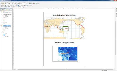
5) Data frames contain different sets of data that are related to one another and they can also show different points of views of the same data in terms of maybe zooming into a certain location and then showing the location in it's certain size.
6) The focus of the second data frame was to get the location of Amelia Earhart and Fred Noonan's disappearance. We got two different types of data, one that shows her flight plan and destinations of where she was going to stop to refuel and the second was a zoomed in location of the area where she and her partner disappeared that shows how deep the ocean was and how little the islands are since you couldn't see them when you saw her complete flight trail.
Monday, September 12, 2011
Lab 2; Amelia Earhart and Fred Noonan
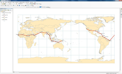
1) The appropriate order would be that Cities Amelia visited would have to go first so you can see them ontop of the flight path in order to know where she landed and what cities were her routine stops for fuel or any other situation that happened to her. Next would be her intended travel path and her path where she disappeared in the Pacific Ocean. Countries would be second to last because if they were first, the flight path and cities visited would get covered. Lastly the graticule lines would be last because those are the longitudes and latitude lines.
2) Oakland, California, Tuscon, Arizona, Louisiana, New Orleans, Miami, Florida, and San Juan, Puerto Rico.
3) India, Yemen, Oman, Mali, and Sudan
4) The end of her planned flight would have seen Noonan and Earhart depart from Lae, Papua New Guinea and see her stop at Howland Island before heading off to Hawaii and then finally ending back in California.
5) Segment: 768.552744 Kilometers and Length: 768.552744 Kilometers
6) The name of the island they should have completed their journey was called Howland Island but she ended up disappearing by Nikumaroro Island.
7) During her journey, Amelia Earhart visited 28 cities around the world.
8) The shortest leg of the flight path would be from St. Louis, Senegal to Darkar, Senegal.
9) The longest leg of her flight was from Natal, Brazil to St. Louis, Senegal.
Wednesday, September 7, 2011
Lab 1; my map
For this assignment, I created my own map on google maps. What I created was my route on my way to school as I live an hour away from California State University Northridge, it usually takes me about 40 minutes to an hour to get from home to Northridge and Northridge to home. What I created on this map were points of areas that might interest someone who is probably driving on the same freeway as I do each and everyday. I added a few points of some interesting places that I have been to during the summer that I feel will be interesting for people to visit who drive on the same freeway as I do.
Wednesday, August 31, 2011
Lab 1; my three maps
The source for my first map was from the blog called "The Sean Effect." What the map shows are the locations across the United States of the fast food restaurant, Subway. This map shows how currently in the United States, Subway has become the number one fast food location with current locations in the United States, beating out other restaurants like McDonalds, Burger King, etc. The type of date that they used for this map was point data as they had to get information of every subway in the United States. Subway has also become my favorite fast food location so to see it beat those hamburger locations, interests me!.
The source for the map was found during a google search here. What this map shows are different dates, starting from June of 2009 where every country in the world was shown to what social media website they used. The map then shows the current year and it shows how the website, facebook has pretty much become the main social networking site for a lot of countries, overlooking their own social networking site. The kind of data that was used to create this map was point data that was being tracked over the course of two years where it shows how facebook has become the top social networking site for a lot of countries.
The source for my last map can be found here. The map shows all the routes and locations for the subway in the city of Paris, France. What I found interesting about it is how color coated everything was in order to find out what line goes where and to make sure you get on the correct train. I found this interesting because i will be going to Paris in december and a map like this would come in handy. The type of resource they used to graph this map were lines. They used lines to map all the subway location around city of Paris so that the people living or people visiting would know what leads to where so they wont get lost or end up somewhere they do not want to be. This map would be a geat tourist help and I can't wait to use it when I go to Paris in December.
Subscribe to:
Comments (Atom)


